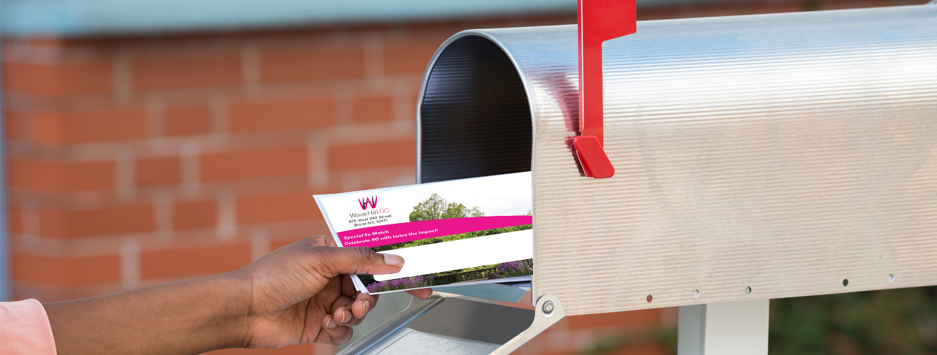
Design Details Get Appeal Letters Opened
Most of the deciding happens before anyone reads a word. Someone pulls the mail out of the box, glances at what’s in their hand for about two seconds, and decides: open now, open later, or toss in the recycling bin. Your appeal has to be designed to grab people’s attention within that two-second window. After 25+ years designing nonprofit appeals, here are some tips that may help your organization strengthen the impact of your appeals.
Small Budget with Big Impact
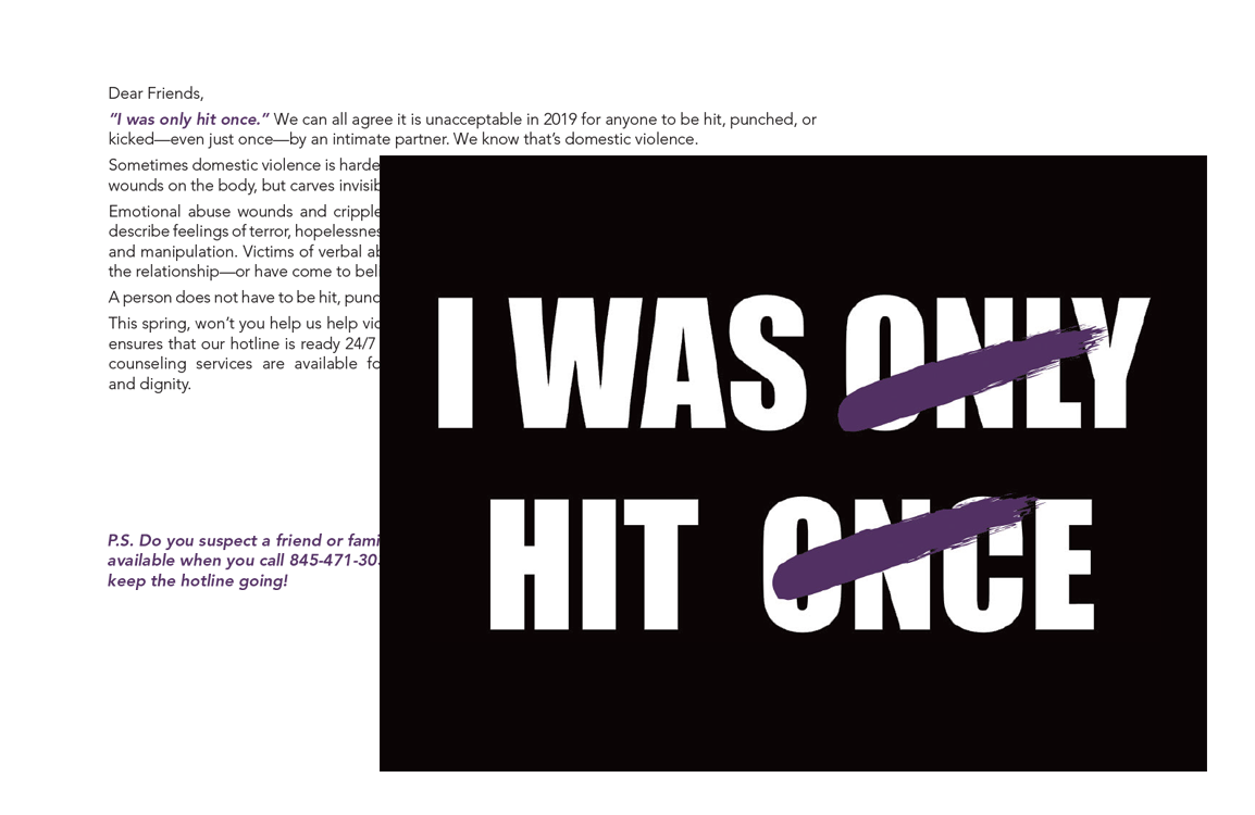
Postcards are the most cost-effective print format, and they work harder than people expect for their size. This post card for Grace Smith House proved that two things matter: an opening hook that grabs reader attention in the first line, and the P.S. line. The P.S. is often the only thing people remember from a piece of direct mail, so use it to reinforce urgency or call out a deadline.
Visuals Increase Response Rates
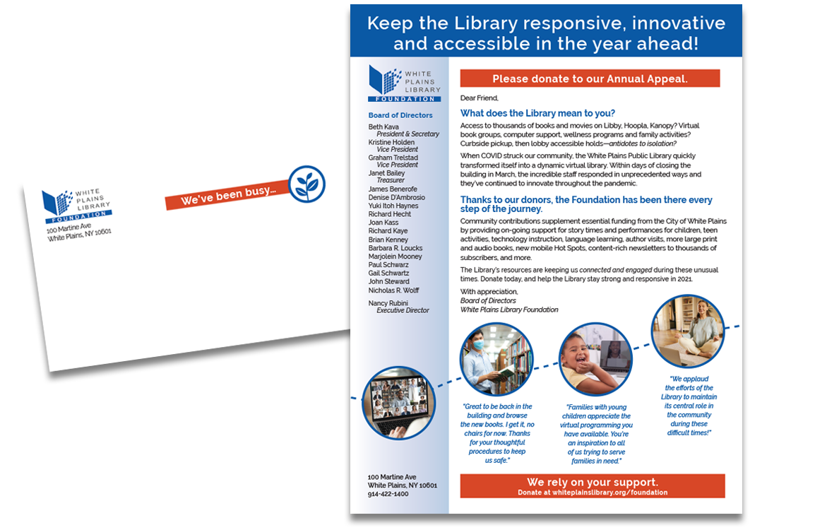
If you’ve only ever sent a plain letter to your donor base, you don’t need to reinvent the wheel to get noticed. For White Plains Library Foundation, we added photos, a colored ask box that was impossible to miss, real quotes from library patrons, and a campaign icon on the envelope which helped increase the odds of getting the envelope opened.
Design for the Mailbox
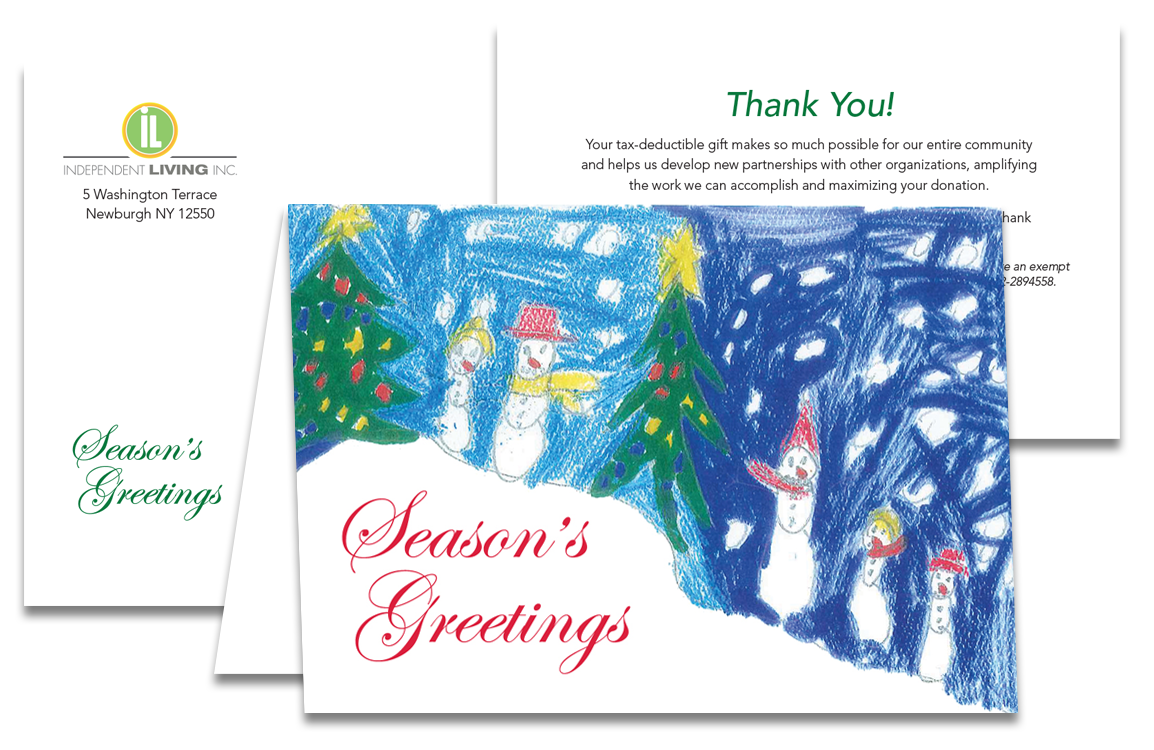
A standard 5×7 card is friendly and easy to handle, which sounds minor until you remember your appeal is competing with bills and catalogs for two seconds of attention. And timing your format to what people already expect helps too. A holiday card format like this one for Independent Living, was sent in December, a time when people are primed to open cards.
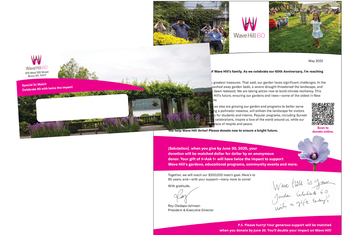
Make a Splash with the Envelope and Save on Costs
A full image of a lush Wave Hill garden makes this envelope really stand out against other mail. And, for this large anniversary mail campaign, it reduced production costs since the printer didn’t need to make sure that the envelope and letter recipient matched. The letter had lots of touches that resonated with donors–real photos of programs and participants, a handwritten note, and a QR code that took someone straight to the donation page.
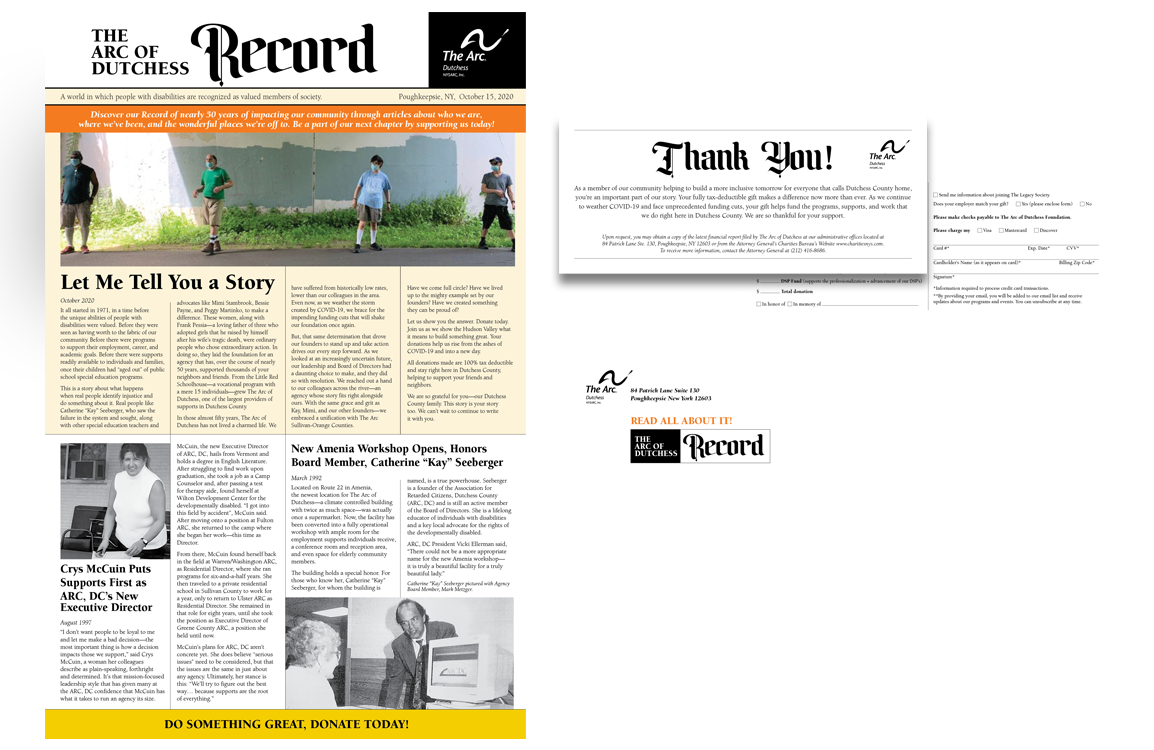
Sometimes It’s Best to do Something Completely Different
If you’re working with a smaller list or you have something significant to share, an unusual format can be worth the departure from your usual approach. A newspaper-style layout like this campaign piece for The Arc of Dutchess, offered the opportunity for natural storytelling that a standard letter would not have, and it was memorable simply because it’s unexpected. Sharing meaningful stories of how your organization achieves your mission create empathy and greater understanding that ultimately leads to greater engagement.