8 Tips to Boost Your Brochure Design
Printed and digital brochures are essential tools in your communications arsenal. Take advantage of the opportunities to get your brochures in people’s hands. For example, direct mail, a rack at the local tourism welcome center, or handing them out personally the goal is to appeal to your potential clients and customers. Tri-fold brochures are easy to slip into a bag or pocket to look at later or share. Even more convenient are online brochures and interactive flipbooks.
Here are our tried-and-true brochure design tips:
- Call-to-Action. This is important. What do you want the reader to do after reading all about you? Some examples are:
- Call for more information
- Buy tickets
- Make a reservation
- Become a member
- Get a free estimate
- Put Yourself in Their Shoes. And by that, we mean the reader. Remember that they may not be familiar with the region or your industry. So avoid using jargon like internal acronyms and industry phrases. Here’s a tip: ask someone outside your business what draws them to your services or location. Make a list and start there. And make sure the text and visuals appeal to your reader.
- Branding. Always include your logo-and tagline if you have one. Adhere to the corporate colors inspired by your logo. Stay away from flashy or loud colors that don’t work with your brand colors. Remember, all of your print and online marketing materials should look like it belongs in the family of everything you design. Consistency is key.
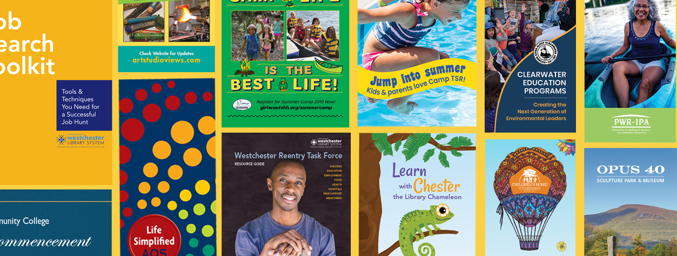
- Power of Visuals. You want your brochure to stand out on the rack or the front desk, so a catchy title and a strong cover is a great way to entice people to open it, or better yet, keep your brochure. Here are some tips:
- Don’t clutter the cover with a lot of text.
- Use callout quotes or testimonials to highlight critical information.
- Visuals over text when it comes to describing data. Graphs and charts are more memorable than words in these cases.
- Leave white space. You want the reader’s eyes to rest and focus on the essential elements of your design. Sometimes less is more.
- Compelling Text. Good writing inspires action. Tell a story with the text and visuals that resonate with the reader. And like the white space philosophy, less is more. Here is some guidance:
- Be succinct. Focus copy yields the best results.
- Bulleted text is easily skimmed and processed.
- Consider hiring a professional.
- Analytics. This is something you may not have considered. If you dedicate a page on your website for each brochure or campaign (abccompany.com/servicesbrochure), you can evaluate the success of the brochure’s call-to-action message by checking the analytics on that web page.
- Stay in Touch. It may seem obvious, but make sure you include all the ways people can contact and follow your business. Be sure to include your:
- Web address
- Phone number
- Street address or location
- Social media icons and your account names
- Email address
And capture email addresses by suggesting they join your email list, too.
- Distribution. Take into consideration how you are going to get your brochures out there.
- Mail – If you are mailing them, be sure to add a couple of water seals to close the edges to mail them without an envelope.
- Direct to locations – Stock rack card boxes wherever your target audience frequents. Places to consider are tourism sites, highway stops, welcome centers, doctors’ offices, police stations, etc.
- Online – Add a downloadable PDF to your website. Consider the brochure as a reward for subscribing to the email list.
Well-designed, well-written brochures can make your company more marketable. In order to grow your business and reach out to more customers, you might want to think about developing a brochure. A good brochure design will ensure great quality and a higher level of customer trust.
Are you looking for a Brochure Designer? Look no further; Full Deck Design is ready to make it happen for you.